The glorious discipline of one good page
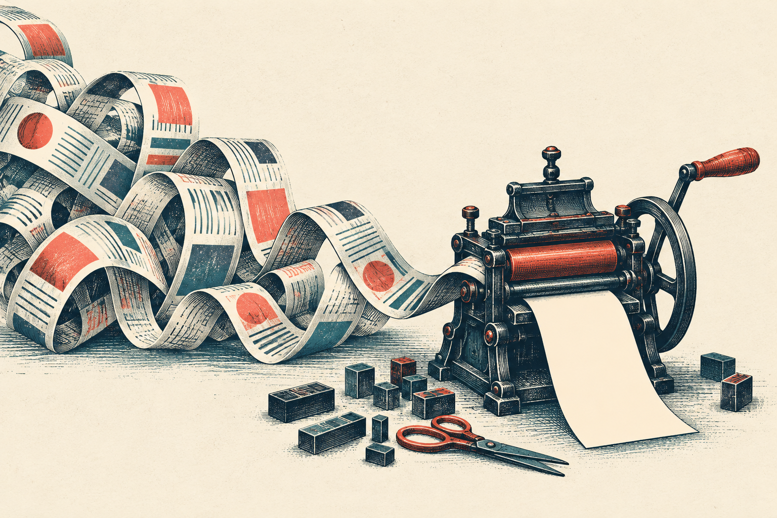
Every printed page asks a blunt question that screens politely avoid: does this deserve to be here? On a screen, the bottom can flee forever. On paper, the edge arrives with the authority of a locked door.
That limit is useful. Navigation bars, share buttons, repeated headings, promotional asides and the paragraph that only clears its throat all compete with the thing you came to read.
Our office printer once produced a heroic first page containing the title, one sentence and an advertisement for toner. The actual instructions began on page two. Nobody was ennobled by this arrangement.
Editing is choosing what the reader gets to notice.
The craft is not simply shrinking. Tiny type can force anything onto one sheet, including the complete terms of a small insurance policy. A better edit protects hierarchy: a clear title, a gracious opening, the necessary argument and a proper landing.
Printers have always negotiated with space. Early compositors kept trays of lead sorts, tightened lines with thin spacing material, and sometimes revised a phrase because the metal would not behave. The page pushed back. Software mostly stopped pushing, and our prose grew comfortable.
The one-page constraint restores a little resistance. It makes the invisible cost of every extra box visible. The result is quicker to scan, cheaper to print, easier to keep, and kinder to the person standing beside the machine.
So cut with purpose. Keep the words that do work. Give the eye somewhere to rest. Then let one quiet page be enough.
one page